


Description and methodology
The MACD Histogram was developed by Thomas Aspray in 1986. He thought that the MACD reacts too slowly and often misses the important changes in the market prices, especially on the weekly charts. First, he tried to modify the MAs and found a shorter MA which made the reaction time shorter. Furthermore, he was looking for a method to forecast the future intersections of MACD lines. The result of his work was the MACD Histogram.
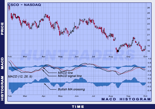
MACD line and the histogram
MACD Histogram is the difference of the MACD and the Signal line. The value of the difference is illustrated in a histogram form. Thus, the midline intersections and the divergences are easily observable. Midline intersections occur when the MACD and the Signal lines meet. When the MACD is larger than the 9-day EMA, the value of the Histogram is positive. When the MACD is smaller than the 9-day EMA, the value of the Histogram is negative.


An increase in the difference between the MACD and the Signal line is clearly visible on the MACD Histogram. A rapid increase on the MACD Histogram means that the MACD’s value increases more rapidly than the 9-day EMA’s value, and that the bullish momentum is strengthening. On the contrary, a rapid decrease on the MACD Histogram means that the MACD’s value decreases more rapidly than the 9-day EMA’s value, and the bearish momentum is strengthening.
Divergence between the MACD line and the histogram
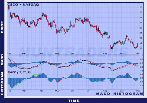
The dependency of the MACD histogram’s movement from the MACD value is observable on the chart above. However, in some cases the MACD is increasing when the MACD histogram is decreasing. In some other cases, the MACD is decreasing when the MACD histogram is increasing. The MACD Histogram does not reflect the MACD value totally. It rather represents the relationship between the MACD and the 9-day EMA. Usually (but not always) a divergence in the MACD Histogram is followed by a movement in the MACD indicator. The first point shows a rapidly moving positive divergence on the MACD Histogram, followed by a bullish direction MA intersection. The second point shows a new peak of the MACD, then the MACD Histogram creates two peaks with similar values. The third point shows a positive divergence, where the MACD Histogram reaches higher lows, while the MACD keeps on decreasing. The fourth point shows a negative divergence, where the MACD Histogram falls to lower lows, while the MACD keeps on increasing.
Trading signals
The main signal of the MACD Histogram is the MA crossings after divergence. A buy signal is when it’s showing a positive divergence and a bullish-direction MA crossing. A sell signal is when it’s showing a negative divergence and a bearish-direction MA crossing. In the MACD Histogram, crossing the midline happens where MACD moving averages have an intersection. Divergence can have several forms and it can have different slopes. Usually analysts differentiate between two types:
- slant divergence,
- peak-trough divergence.
Slant divergence happens when a continuous and consistent movement happens from one direction to the other (can be both upwards or downwards movement), which forms a divergence. Slant divergence usually happens usually in shorter periods. Slant divergence can also have minor peaks and troughs.
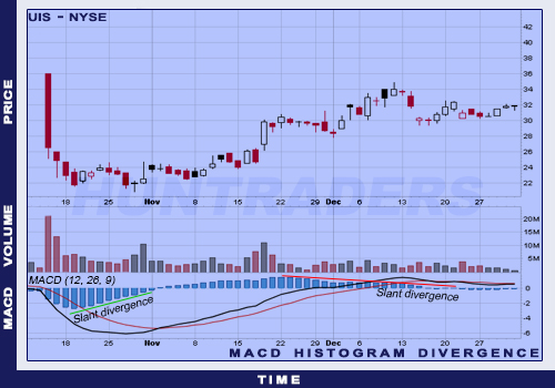
Slant divergence on the MACD Histogram
Peak-trough divergence happens when the divergence consists of at least two maximum or two minimum points. Two or more increasing troughs form a positive divergence, two or more decreasing peaks form a negative divergence. Peak-trough divergence usually happens in longer periods than the slant divergence. On daily charts, peak-trough divergences can last from 2 weeks up to several months. The longer and steeper the divergence, the more reliable the signal. Shorter and flatter divergences can give false signals. Peak-trough divergence’s signals are usually more reliable than the slant divergence’s.
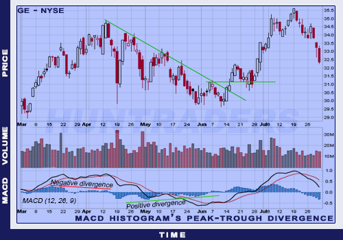
Peak-trough divergence on the MACD Histogram
Use
Thomas Aspray has developed the MACD Histogram to forecast intersections of moving averages. Divergences between MACD and MACD Histogram are the main tools to forecast the movements of MAs.
- Positive divergence in the MACD Histogram indicates the strengthening of the MACD which means an upcoming bullish-direction MA across.
- Negative divergence in the MACD Histogram indicates the weakening of the MACD which means an upcoming bearish-direction MA across.
The biggest advantage of the MACD Histogram is the ability to forecast the intersections of MACD lines. There is usually divergence on the Histogram before the MACD lines meet. Investors can forecast trend changes with bigger punctuality with paying attention to the MACD Histogram. It can be used on daily, weekly, or monthly charts as well. However, different time horizons require the use of slower or faster moving averages. On weekly charts, the indicator signals longer trend changes. After the trend change has been recognised, daily charts can help to identify the buy and sell points.
There are only two reasons to open a position in the opposite direction of the current trend. Weekly MACD Histogram can show longer-term signals. Trading to short-term signals should only be implemented, if the signals match the actual trend’s direction. When the long-term trend is bullish, the negative divergence in the MACD Histogram and a bearish type of intersection can be a valid signal. When the long-term trend is bearish, the positive divergence in the MACD Histogram and a bullish type of crossing can be a valid signal.
MACD Histogram is an indicator of another indicator. MACD is derived from the market price changes and MACD Histogram is derived from the MACD. Therefore, MACD Histogram is the second derivative of price changes. Movements on the Histogram should not be directly compared with the movement of share prices. The aim of the indicator is to recognise MACD crosses, impulsive trading decisions should never be based on the Histogram. The Histogram should be used along with other technical analysis tools. Using multiple tools helps to avoid opening positions too early. Weekly and daily chart’s Histograms could be used together to improve the quality of decisions. Naturally, more daily charts should be used than weekly. The number of signals will decrease if the trader only takes those daily signals seriously which have been justified by weekly signals as well. These signals should only be implemented in long-term, in the trend’s direction. Short and flat divergences should be treated with caution. They can forecast opportunities correctly, but many of them can give false signals. To filter out these divergences, one should look for divergences with two or more peaks or troughs. Then compare the peaks and troughs with historical event, to get a grasp of the significance of those divergences.
Examples
The chart below illustrates a weekly chart for Lennar (LEN). There is a strong momentum in the period between December 2001 and March 2002, as the share price increased from USD 16 to USD 26. This weekly chart also shows the share’s negative divergence.
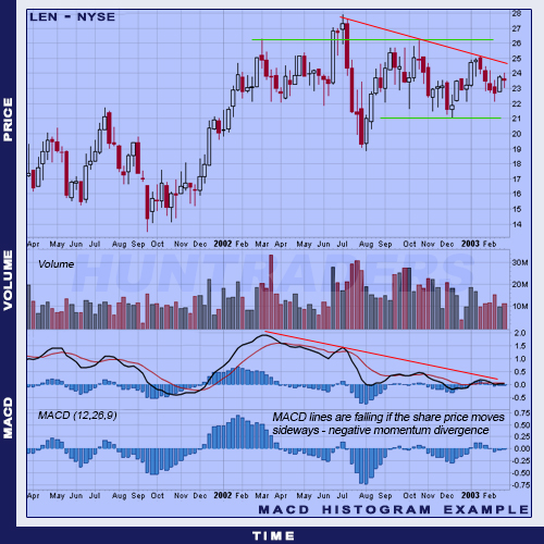
MACD Histogram example on a sideways market